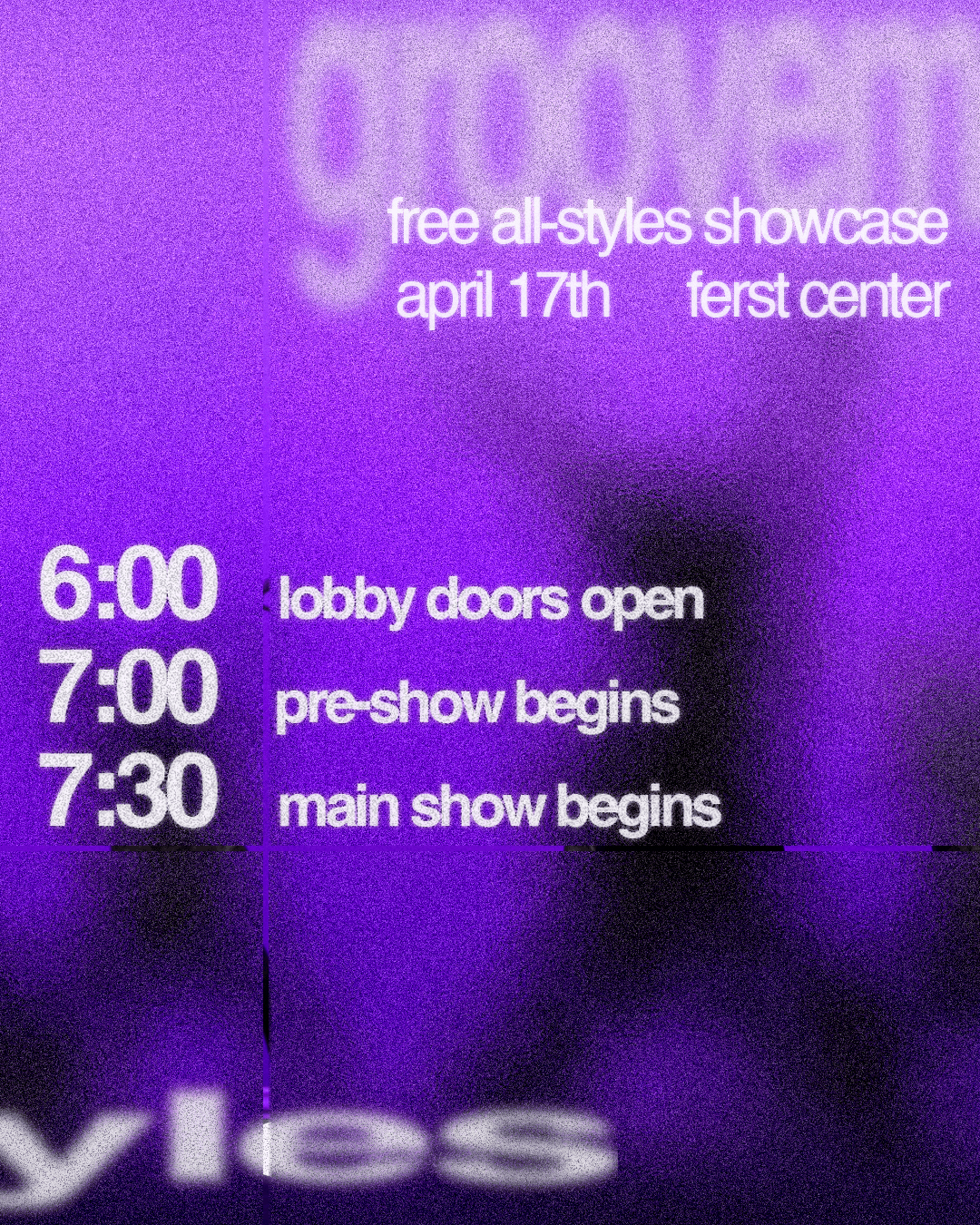
TEKSTYLES DANCE TEAM
Fall 2025
For Tekstyles, I developed a cohesive visual system for the team’s Instagram presence. While the brand colors were already defined as purple, blue, and gray, I refined the palette into cooler, darker tones to establish consistency and reinforce a sleek, powerful identity. I paired Helvetica Bold with Helvetica Neue Thin to create a clear typographic hierarchy, guiding the viewer from event titles to details while maintaining a timeless and editorial feel. Textural elements were integrated to emphasize movement and amplify the energy of the dancers to add visual drama without overwhelming the composition.
Click to interact!
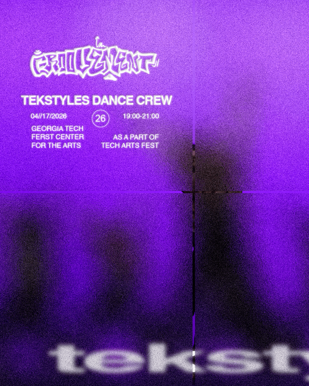
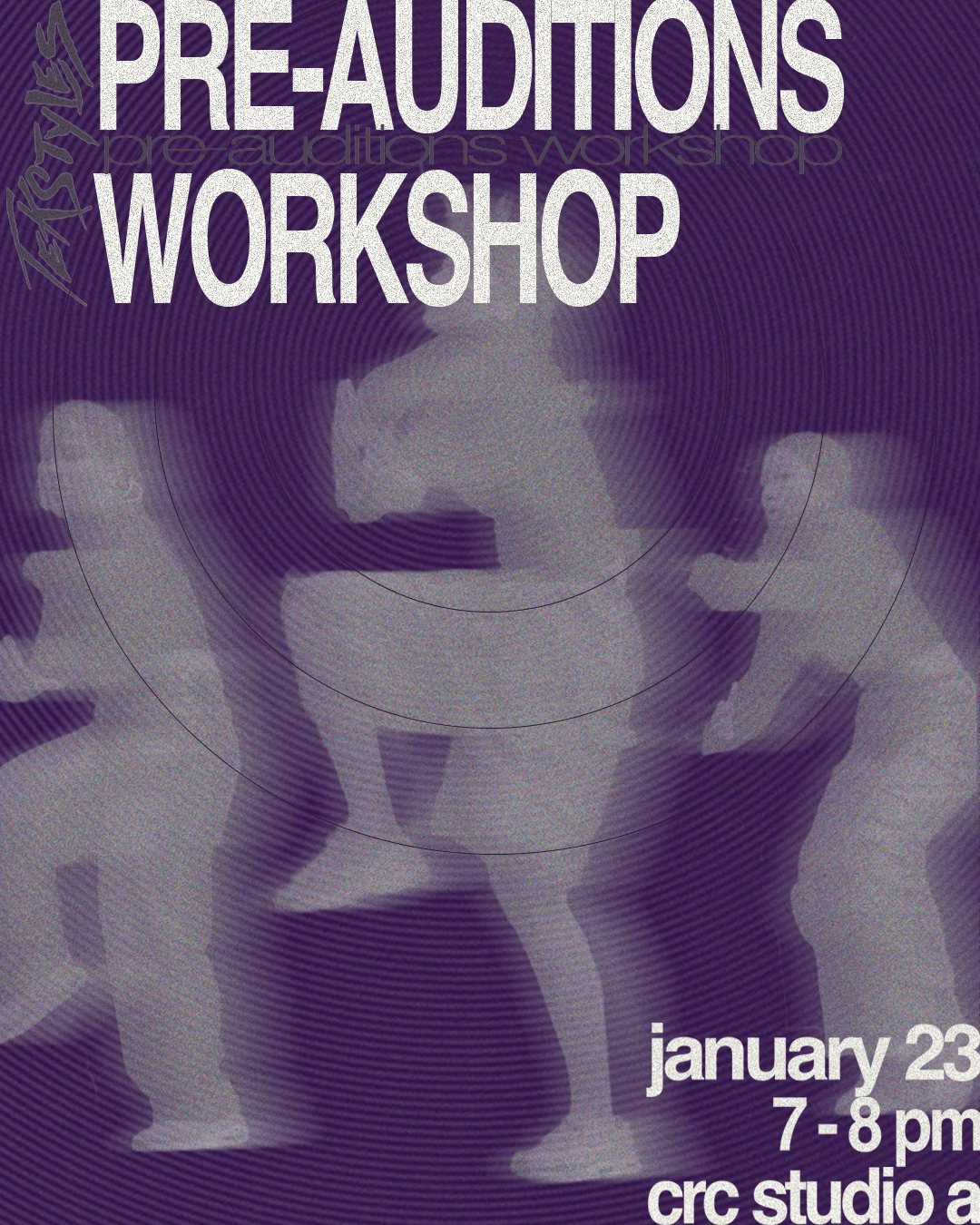
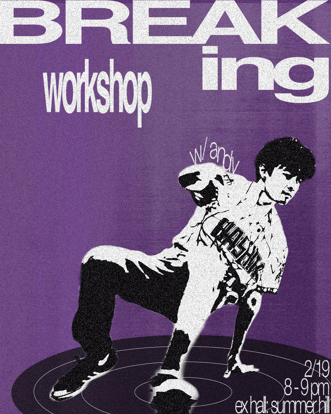


For the logos, I designed marks that would stand out on both physical merchandise and digital flyers. Because the team prides itself on being the premier hip hop dance group on Georgia Tech’s campus, I drew from classic graffiti aesthetics to capture a bold, street-inspired energy. I also created a cleaner, more refined logo using warped serif letterforms for situations that called for a more serious tone. While more minimal, it still aligns with the powerful, street-style identity the team aims to represent.


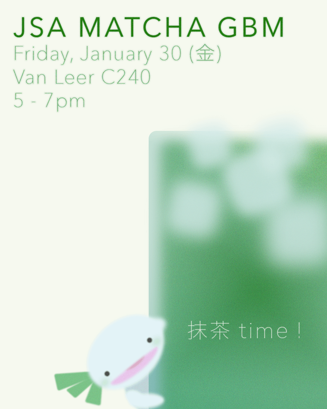
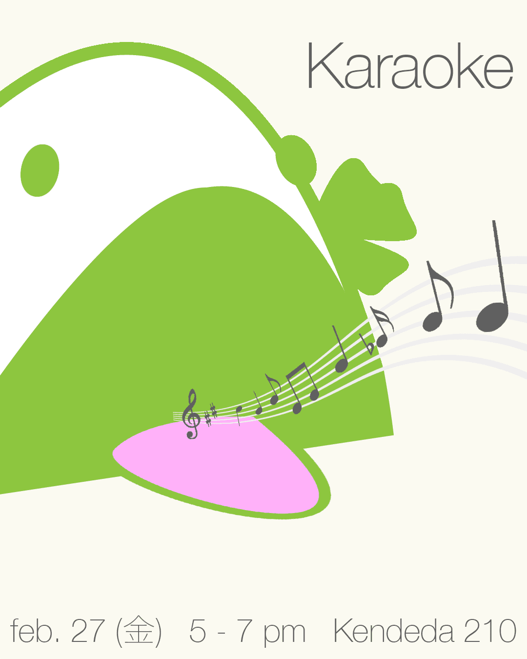
OTHERS
Adobe, Japanese Student Association (JSA), Personal Projects